> ## Documentation Index
> Fetch the complete documentation index at: https://developers.argosidentity.com/llms.txt
> Use this file to discover all available pages before exploring further.
# Liveform Customization
> Learn how to provide brand-appropriate user experience through result page and language-specific image settings.
Result page customization function allows you to customize the result page displayed to users after ID check authentication completion. You can provide clear and consistent brand experiences to users by configuring customized pages by language for each status: Approved, Rejected, and Pending.
## Use Cases
Banks or fintech services can provide next step guidance (account opening, card issuance, etc.) along with welcome messages upon approval, and guide retry methods or customer center contact information upon rejection. For pending status, clearly guide additional document submission methods and expected processing time to alleviate customer anxiety.
Platforms providing international services can configure result pages in each country's language to provide localized user experiences. User-friendly interfaces can be built by utilizing images and messages reflecting each region's cultural characteristics.
Online marketplaces can guide sales start guides and promotion benefits when seller authentication is completed, and provide improvement plans and reapplication procedures in detail upon rejection.
**User Experience Optimization**
Result pages are important touchpoints in the user journey. User satisfaction and service completion rates can be improved by providing appropriate emotional tone and follow-up action guidance for each status.
***
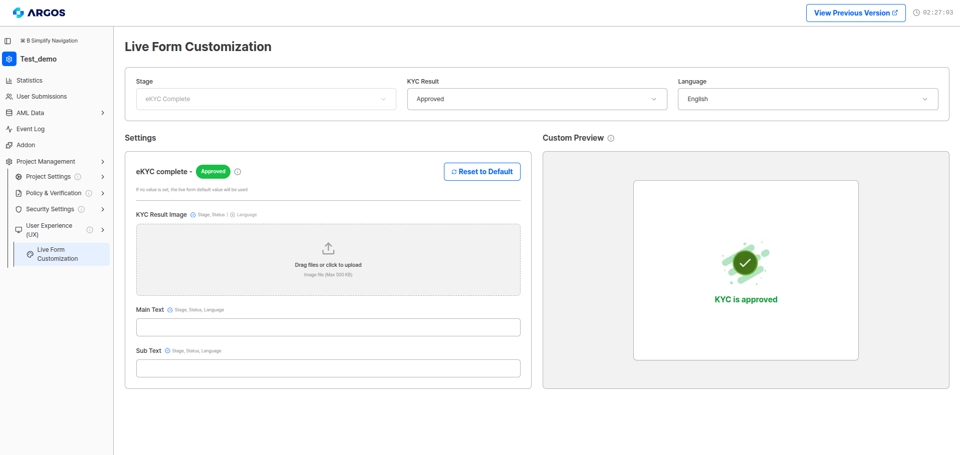
## Step 1: Access Result Page Settings
Access the result page settings menu for the project in the dashboard to customize the ID check project's result page.
 ***
## Step 2: Status and Language Settings
Select the status and language combination to configure the result page.
**Configurable by Status**
Individual settings are possible for each status: Approved, Rejected, and Pending, and different pages can be configured for all supported languages.
| Setting | Description |
| --------------------- | ----------------------------------------------------------------------------------------- |
| **Status & Language** | Select by combining result status (approval/rejection/pending) and language to customize. |
| **Preview Function** | Can check results in real-time through the preview window on the right during settings. |
***
## Step 3: Visual Element Settings
Configure visual components for each result page.
| Setting | Description |
| ---------------------- | ------------------------------------------------------------------------------- |
| **KYC Result Image** | Upload images to display for each page to reflect brand identity. |
| **Image Optimization** | Recommended image specifications suitable for various devices and screen sizes. |
***
## Step 4: Text Content Writing
Write messages to deliver to users.
| Field | Description | Limit |
| ------------- | ----------------------------------------------------------------------------------- | ---------------------- |
| **Main Text** | Intuitive and clear main message appropriate for identity authentication results | Maximum 125 characters |
| **Sub Text** | Detailed information that supplements main text and guides user's follow-up actions | Maximum 100 characters |
**Text Writing Guidelines**
Enter main text and sub text for approval/pending/rejection status for each supported language (top right). Detailed rejection messages that users can see are not customizable.
After completing the detailed settings above, click **Save**.
***
## Step 5: Testing and Optimization
After completing result page settings, you can verify and optimize in the following ways:
Check result pages through test submissions for each status.
Review page display in various language settings.
Check brand consistency of images and text.
Continuously improve effectiveness by analyzing user behavior data and feedback.
***
## Benefits of Result Page Customization
Provides user experience maintaining brand consistency.
Language-specific customized settings are possible for multi-country services.
Improves user satisfaction through status-optimized message delivery.
Improves service completion rates through follow-up action guidance.
Liveform customization function is continuously being upgraded. We will provide identity authentication functions connected to your service through more diverse options.
***
## Custom Theme (query string)
Custom Theme is not configured from this dashboard page. It is applied by appending query string parameters directly to the liveform URL.
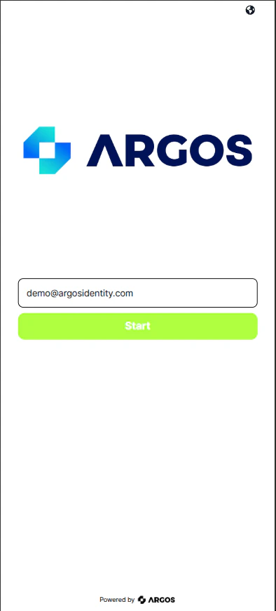
In addition to result page customization, you can apply your brand colors to the liveform's CTA buttons and positive action UI elements using the `mainColor` and `innerColor` query string parameters. This enables you to maintain consistent branding throughout the entire KYC flow.
### Query string parameters
| Parameter | Format | Description |
| ------------ | -------------------------------------- | ------------------------------------------------------------------------ |
| `mainColor` | 6-digit hex with `#` (e.g., `#AEFF00`) | Sets the primary color for CTA buttons and main action elements. |
| `innerColor` | 6-digit hex with `#` (e.g., `#FFFFFF`) | Sets the inner (text/icon) color within CTA buttons and action elements. |
* The `#` prefix is required. Values without `#` (e.g., `AEFF00`) will not be applied correctly.
* Must be encrypted for use. The values above must be included inside the `encrypted` parameter.
**Example URL:**
```
https://form.argosidentity.com?pid={project_Id}&encrypted={'mainColor': '#AEFF00', 'innerColor': '#FFFFFF'}
```
The content inside `encrypted` must be encrypted. The URL above is shown unencrypted for illustration only.
### Color preview
***
## Step 2: Status and Language Settings
Select the status and language combination to configure the result page.
**Configurable by Status**
Individual settings are possible for each status: Approved, Rejected, and Pending, and different pages can be configured for all supported languages.
| Setting | Description |
| --------------------- | ----------------------------------------------------------------------------------------- |
| **Status & Language** | Select by combining result status (approval/rejection/pending) and language to customize. |
| **Preview Function** | Can check results in real-time through the preview window on the right during settings. |
***
## Step 3: Visual Element Settings
Configure visual components for each result page.
| Setting | Description |
| ---------------------- | ------------------------------------------------------------------------------- |
| **KYC Result Image** | Upload images to display for each page to reflect brand identity. |
| **Image Optimization** | Recommended image specifications suitable for various devices and screen sizes. |
***
## Step 4: Text Content Writing
Write messages to deliver to users.
| Field | Description | Limit |
| ------------- | ----------------------------------------------------------------------------------- | ---------------------- |
| **Main Text** | Intuitive and clear main message appropriate for identity authentication results | Maximum 125 characters |
| **Sub Text** | Detailed information that supplements main text and guides user's follow-up actions | Maximum 100 characters |
**Text Writing Guidelines**
Enter main text and sub text for approval/pending/rejection status for each supported language (top right). Detailed rejection messages that users can see are not customizable.
After completing the detailed settings above, click **Save**.
***
## Step 5: Testing and Optimization
After completing result page settings, you can verify and optimize in the following ways:
Check result pages through test submissions for each status.
Review page display in various language settings.
Check brand consistency of images and text.
Continuously improve effectiveness by analyzing user behavior data and feedback.
***
## Benefits of Result Page Customization
Provides user experience maintaining brand consistency.
Language-specific customized settings are possible for multi-country services.
Improves user satisfaction through status-optimized message delivery.
Improves service completion rates through follow-up action guidance.
Liveform customization function is continuously being upgraded. We will provide identity authentication functions connected to your service through more diverse options.
***
## Custom Theme (query string)
Custom Theme is not configured from this dashboard page. It is applied by appending query string parameters directly to the liveform URL.
In addition to result page customization, you can apply your brand colors to the liveform's CTA buttons and positive action UI elements using the `mainColor` and `innerColor` query string parameters. This enables you to maintain consistent branding throughout the entire KYC flow.
### Query string parameters
| Parameter | Format | Description |
| ------------ | -------------------------------------- | ------------------------------------------------------------------------ |
| `mainColor` | 6-digit hex with `#` (e.g., `#AEFF00`) | Sets the primary color for CTA buttons and main action elements. |
| `innerColor` | 6-digit hex with `#` (e.g., `#FFFFFF`) | Sets the inner (text/icon) color within CTA buttons and action elements. |
* The `#` prefix is required. Values without `#` (e.g., `AEFF00`) will not be applied correctly.
* Must be encrypted for use. The values above must be included inside the `encrypted` parameter.
**Example URL:**
```
https://form.argosidentity.com?pid={project_Id}&encrypted={'mainColor': '#AEFF00', 'innerColor': '#FFFFFF'}
```
The content inside `encrypted` must be encrypted. The URL above is shown unencrypted for illustration only.
### Color preview
 ### What changes
#### `mainColor` — affected elements by screen
| Screen | Affected element |
| ------------------------------------------------ | -------------------------------------------------------------------------------------------------------- |
| Start page (`/main`) | Start / Submit button (gradient background) |
| ID card capture (`/shoot-id-card`) | Capture button, front-side direction label color, capture guide (positive slide background, icon stroke) |
| ID card back capture (`/shoot-id-card-back`) | Capture button, capture guide (positive slide background, icon stroke) |
| ID card review (`/id-card-review`) | Submit / Re-capture button |
| Knowledge-Based form (`/knowledge-form`) | Next step button |
| Additional info form (`/additional-form`) | Submit button |
| Address search (`/address`) | Select button, map pin icon background, "Change address" link text color |
| Selfie capture — passive (`/shoot-face`) | Guide text, progress status text |
| Active Liveness guide (`/active-liveness-guide`) | Step guide text and icon colors |
| Submission result (`/submission-result`) | Retry / Done button, result status icon (approved) |
| Face Auth (`/face-auth`, `/face-auth-result`) | Start button, result confirmation button |
| Error page (`/error-page`) | Restart / Retry button (refresh, not-allow-file-upload types only) |
| PC QR scan page | Page background gradient, QR code corner border color |
| Alert popups (all screens) | Success icon only (`success` type); error / warning / info icons are not affected |
| SVG icons (all screens) | Positive theme gradient icons (e.g., ShieldCheck) |
#### `innerColor` — affected elements
| Screen | Affected element |
| ------------------------- | ------------------------------------------------------------------------ |
| All screens — CTA buttons | Button text color (not applied when `innerColor` is `#FFFFFF` or `#FFF`) |
| All screens — Header | Currently selected language button text color |
| ID card capture guide | Positive slide notice text color |
#### Not affected
| Element | Reason |
| --------------------------------------------- | -------------------------------------- |
| Negative indicators (Rejected, Warning icons) | Fixed to negative theme colors |
| Error / Warning / Info alert popup icons | Fixed to their respective theme colors |
| Black body text | Not targeted by Custom Theme |
| ID card back-side direction label | Fixed to pink color |
Custom Theme currently applies only to positive action elements such as CTA buttons and approval-related UI. Negative indicators (rejected, warning) and existing black text are not affected. Support for these elements is planned for a future update.
You can easily test Custom Theme parameters using the [Query String Encryption/Decryption Tool](/dashboard/en/project-management/project-settings/project-info#query-string-encryptiondecryption-tool) in the dashboard under **Project Settings > Project Info**.
***
## Related Documentation
View branding and Return URL settings.
View list of languages supported by liveform.
Learn how to configure Return URLs.
### What changes
#### `mainColor` — affected elements by screen
| Screen | Affected element |
| ------------------------------------------------ | -------------------------------------------------------------------------------------------------------- |
| Start page (`/main`) | Start / Submit button (gradient background) |
| ID card capture (`/shoot-id-card`) | Capture button, front-side direction label color, capture guide (positive slide background, icon stroke) |
| ID card back capture (`/shoot-id-card-back`) | Capture button, capture guide (positive slide background, icon stroke) |
| ID card review (`/id-card-review`) | Submit / Re-capture button |
| Knowledge-Based form (`/knowledge-form`) | Next step button |
| Additional info form (`/additional-form`) | Submit button |
| Address search (`/address`) | Select button, map pin icon background, "Change address" link text color |
| Selfie capture — passive (`/shoot-face`) | Guide text, progress status text |
| Active Liveness guide (`/active-liveness-guide`) | Step guide text and icon colors |
| Submission result (`/submission-result`) | Retry / Done button, result status icon (approved) |
| Face Auth (`/face-auth`, `/face-auth-result`) | Start button, result confirmation button |
| Error page (`/error-page`) | Restart / Retry button (refresh, not-allow-file-upload types only) |
| PC QR scan page | Page background gradient, QR code corner border color |
| Alert popups (all screens) | Success icon only (`success` type); error / warning / info icons are not affected |
| SVG icons (all screens) | Positive theme gradient icons (e.g., ShieldCheck) |
#### `innerColor` — affected elements
| Screen | Affected element |
| ------------------------- | ------------------------------------------------------------------------ |
| All screens — CTA buttons | Button text color (not applied when `innerColor` is `#FFFFFF` or `#FFF`) |
| All screens — Header | Currently selected language button text color |
| ID card capture guide | Positive slide notice text color |
#### Not affected
| Element | Reason |
| --------------------------------------------- | -------------------------------------- |
| Negative indicators (Rejected, Warning icons) | Fixed to negative theme colors |
| Error / Warning / Info alert popup icons | Fixed to their respective theme colors |
| Black body text | Not targeted by Custom Theme |
| ID card back-side direction label | Fixed to pink color |
Custom Theme currently applies only to positive action elements such as CTA buttons and approval-related UI. Negative indicators (rejected, warning) and existing black text are not affected. Support for these elements is planned for a future update.
You can easily test Custom Theme parameters using the [Query String Encryption/Decryption Tool](/dashboard/en/project-management/project-settings/project-info#query-string-encryptiondecryption-tool) in the dashboard under **Project Settings > Project Info**.
***
## Related Documentation
View branding and Return URL settings.
View list of languages supported by liveform.
Learn how to configure Return URLs.